Passenger page: Easing the pain of data entry

Challenge: Customer error rates on the passenger details page consistently between 4-5%
Solution: Redesign the page to reduce noise and keep only the information necessary for the booking
Outcome: Error rates reduced significantly - less than >.1%!
Background
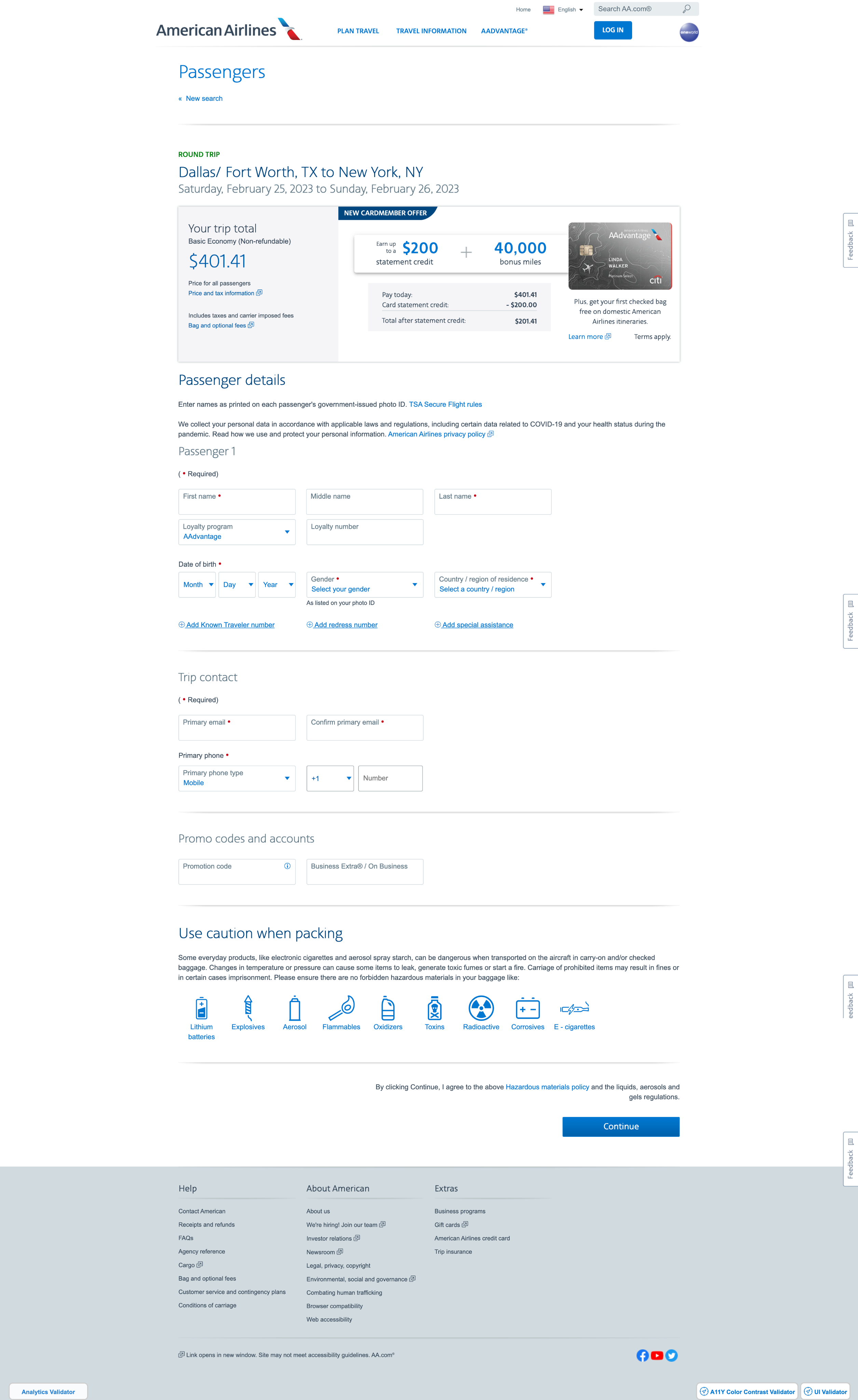
The passenger details page is essential for processing their needed travel information, but users consistently encountered errors that slowed down data entry. Confusing labels and complex layouts lead to mistakes in entering names, contact details, and travel documents, causing delays and lowering customer satisfaction. In addition, extra work is made for AA staff to go in and fix these mistakes. To address this, we needed a redesign of the page to improve the user experience with a cleaner interface and clearer instructions.
Goals:
- reduce errors by 2% or greater
- increase efficiency by reducing time on task
- enhance the experience for both passengers and staff
Discovery
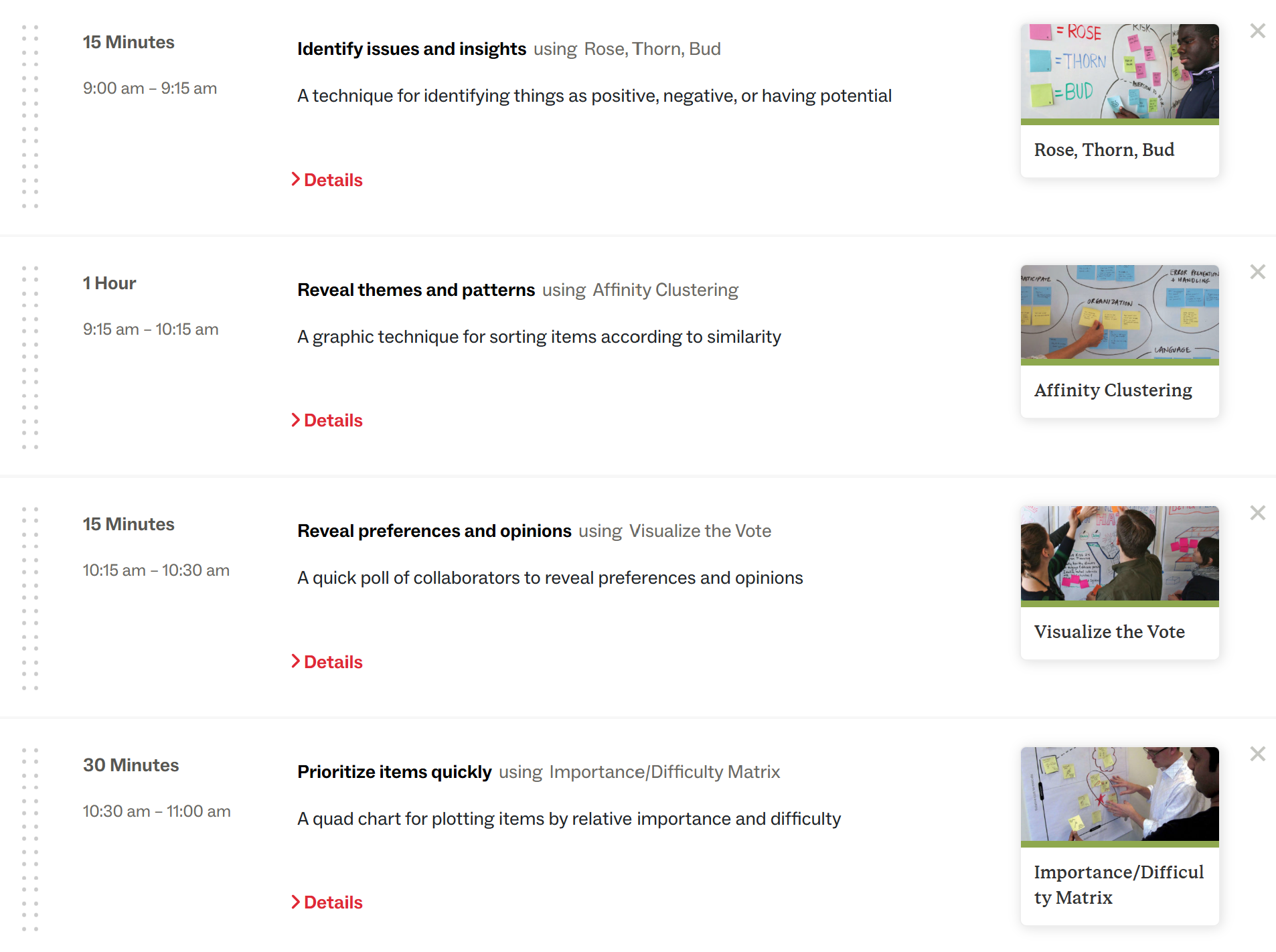
Using design thinking, the business and UX came together to determine what was most important to live on the passenger page and what could go away. Pictured below was our LUMA recipe where we used:
- Rose, Thorn, Bud to find the positive, negative and potential improvements on the page
- Affinity Clustering to take all those ideas and cluster them into themes
- Visualize the vote to determine key needs of the new design
- Importance/Difficulty Matrix to plot the top votes into a grid of highest ROI, quick wins, lowest ROI and strategic.
The key takeaways from design thinking were:
- remove unnecessary fields from the page (Promo codes and accounts),
- reduce the ad size and place lower on the page, and
- chunk the passenger data entry into smaller bites.
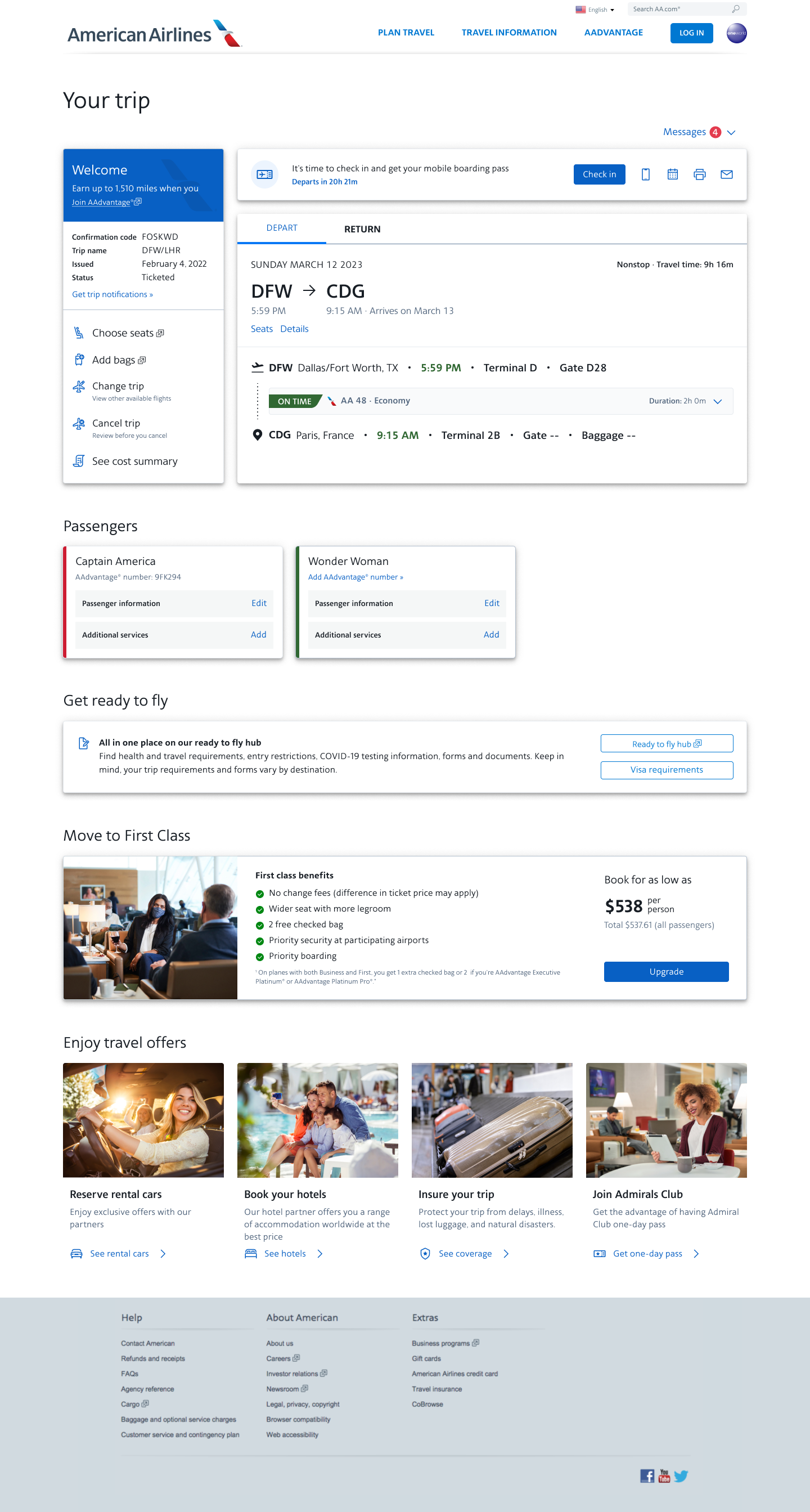
In conjunction with this project, the Manage Reservations team was also updating their landing page. They were also needing to find a way for passengers to view/edit their personal data without taking up too much space on the page. Our two teams decided to use a card component to be consistent across Shop/Buy and Manage Res.
Design and Research
Iterations on how the cards could be displayed were started asking ourselves “how do they select who will be flying?”, “how will the customer edit passenger details?”, “how can account holders select saved companions?”, “how can they assign special services?”, etc.
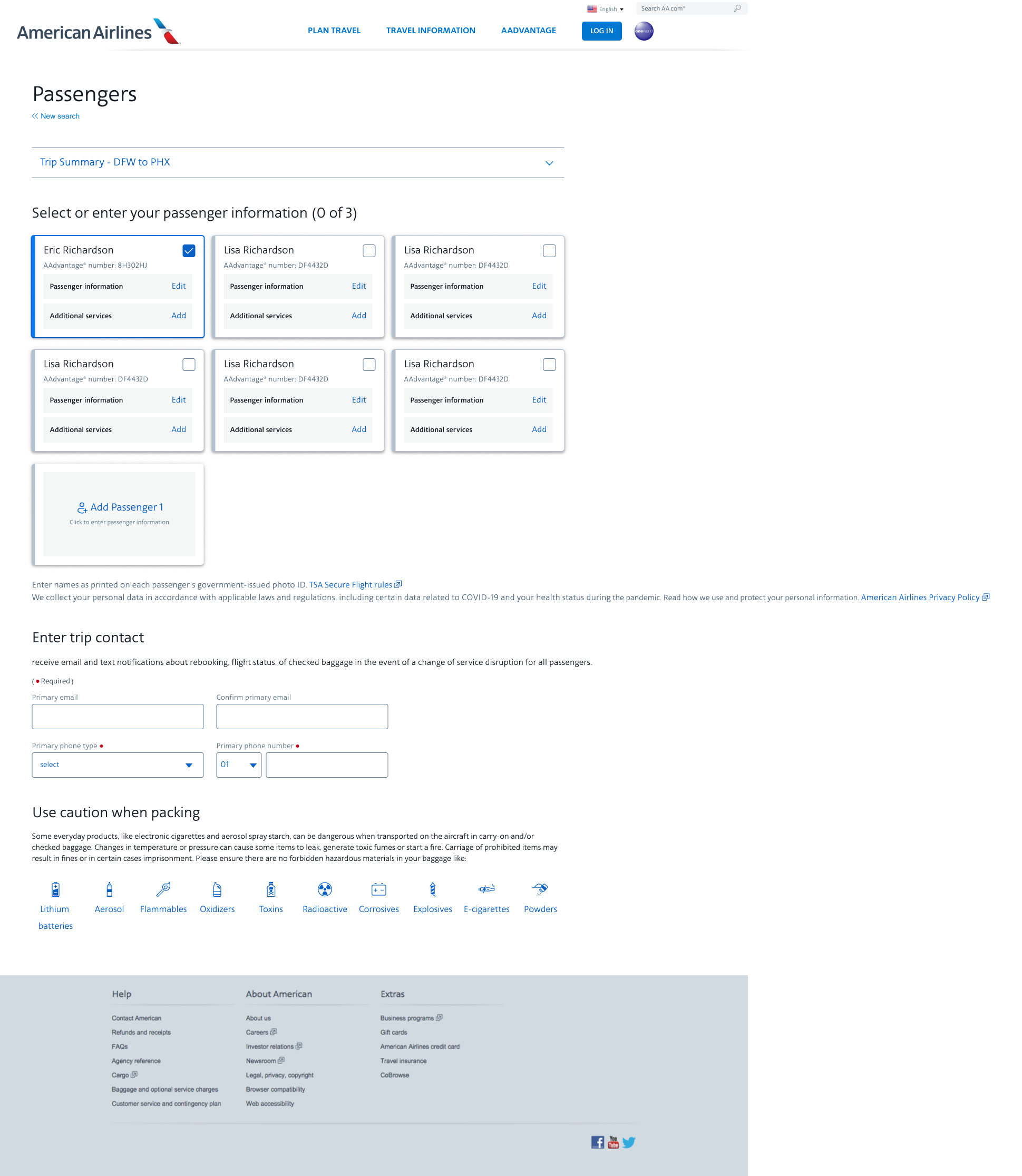
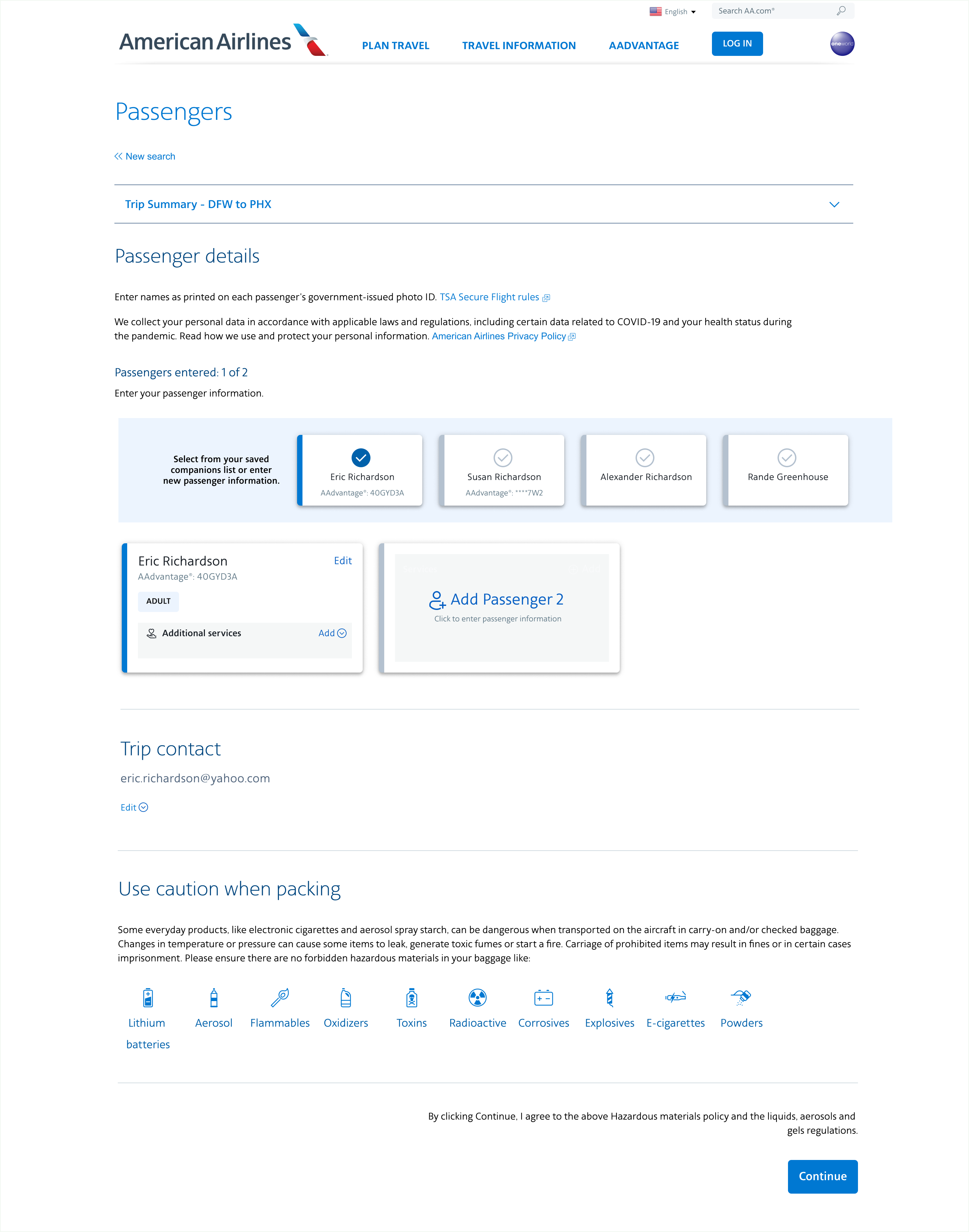
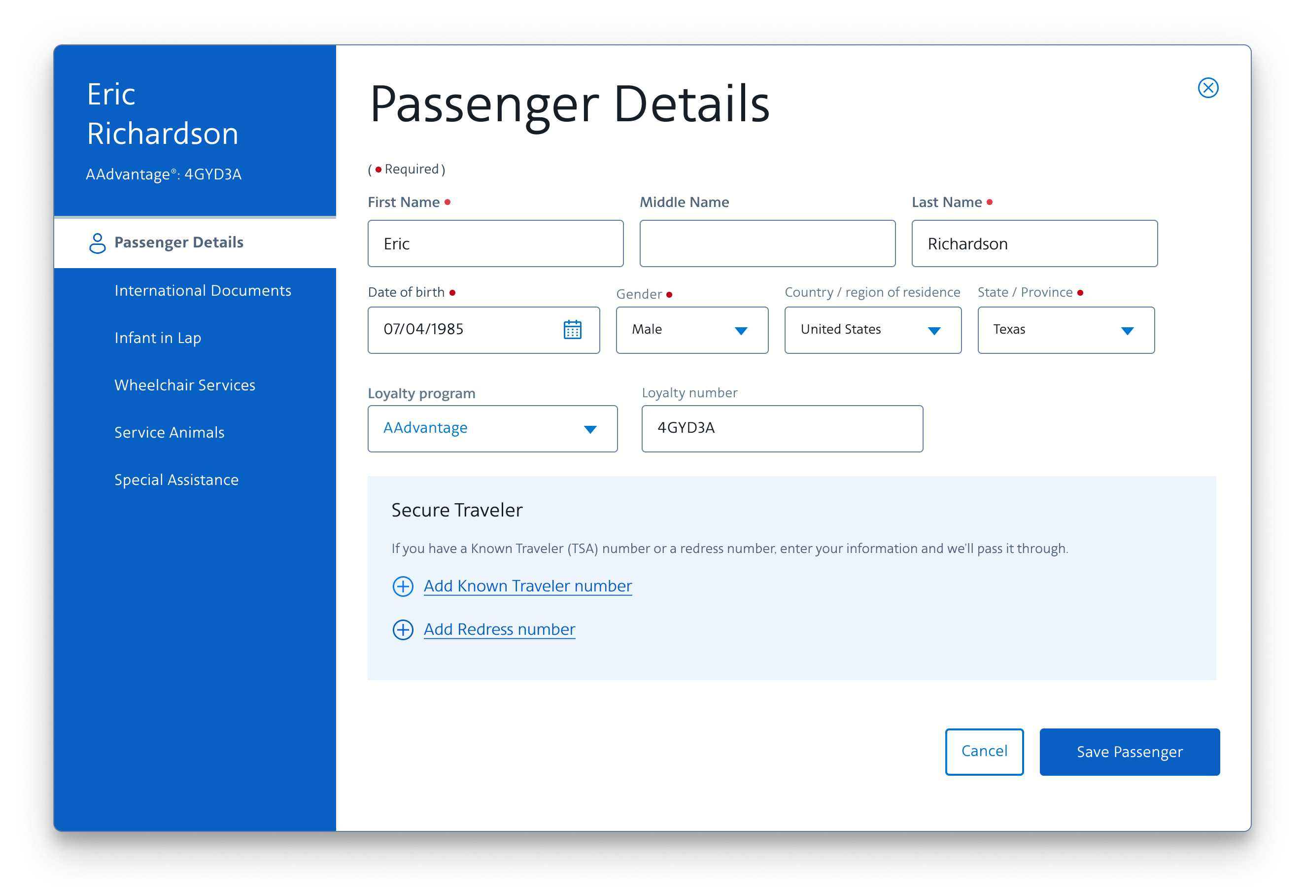
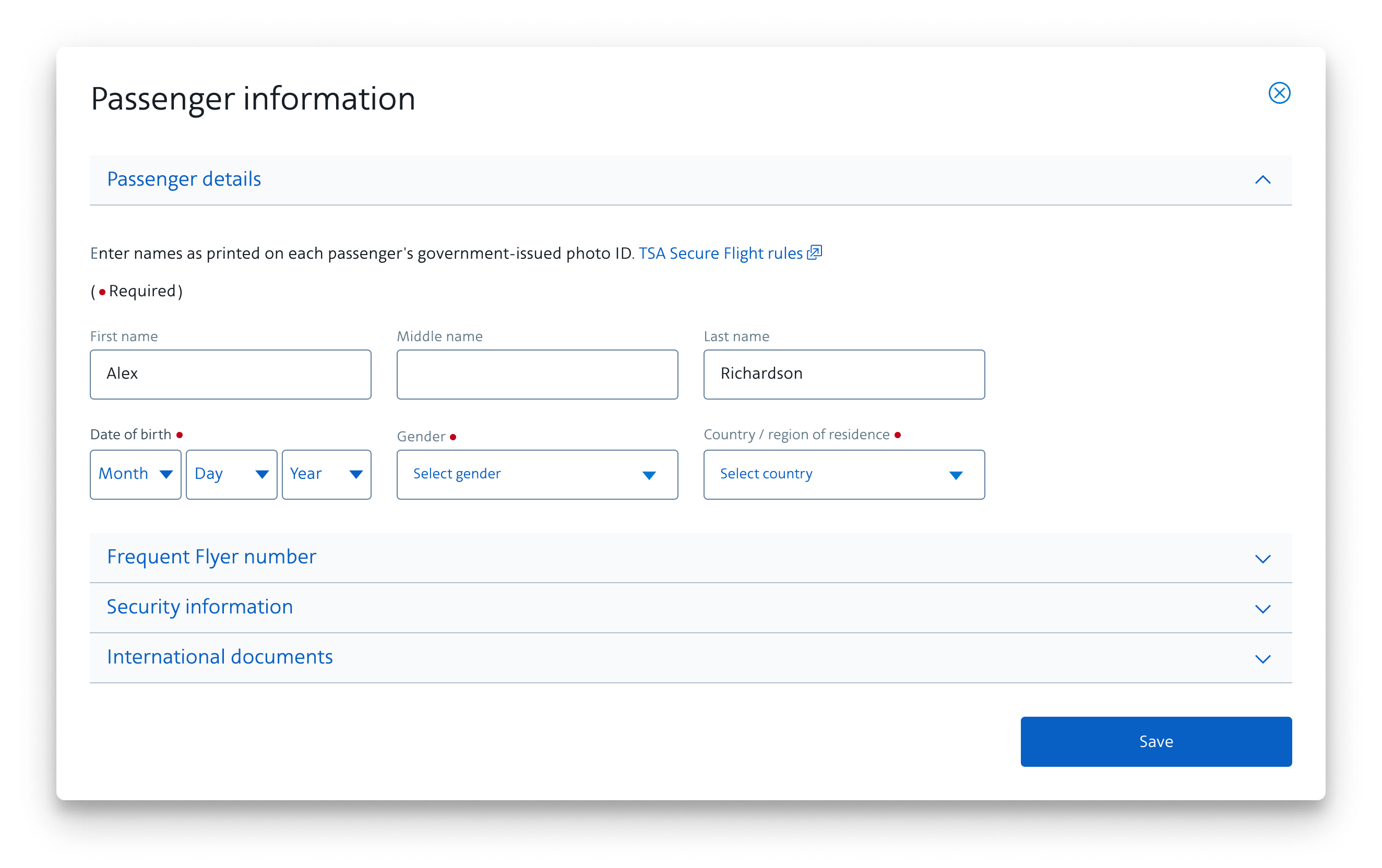
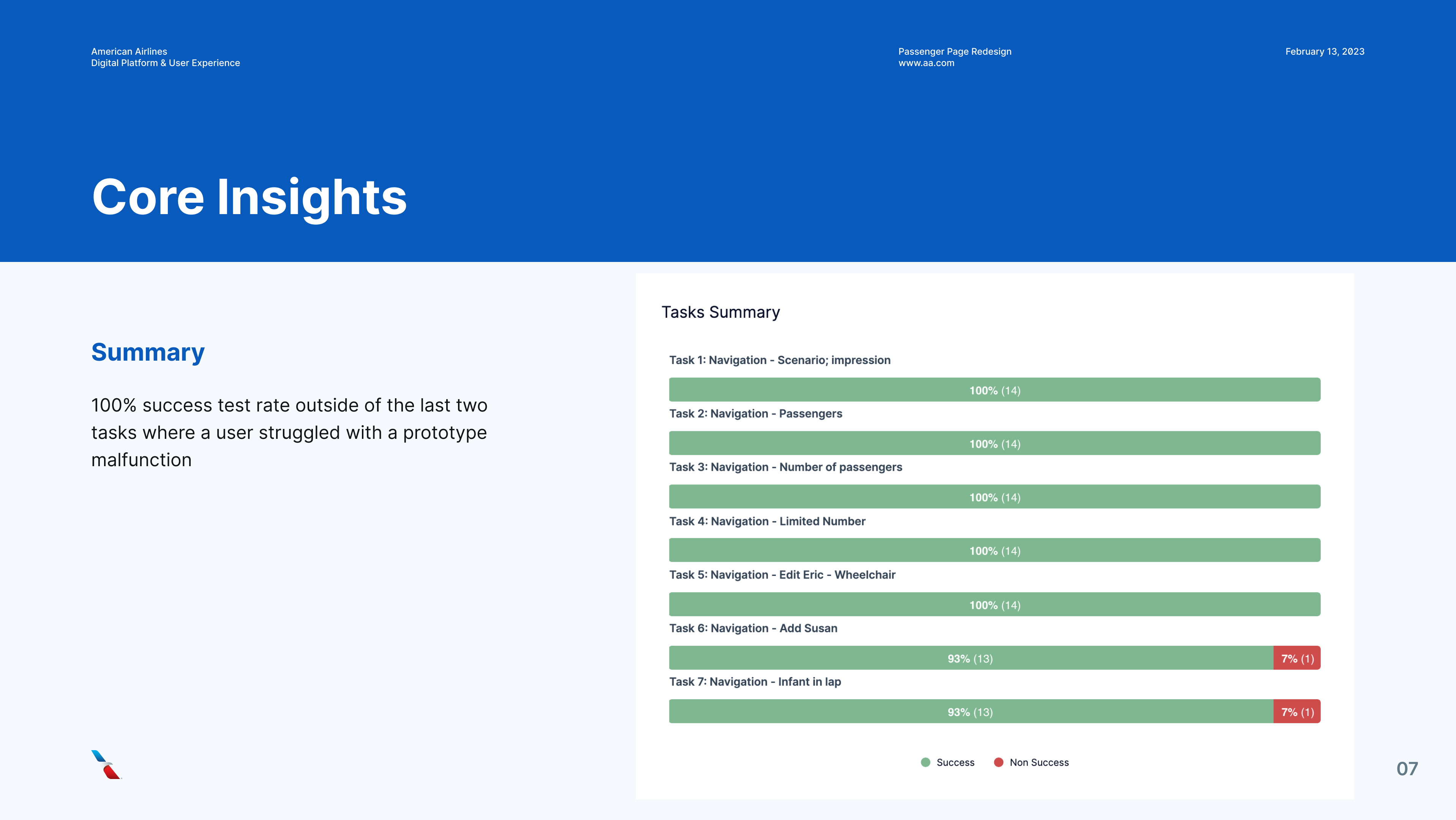
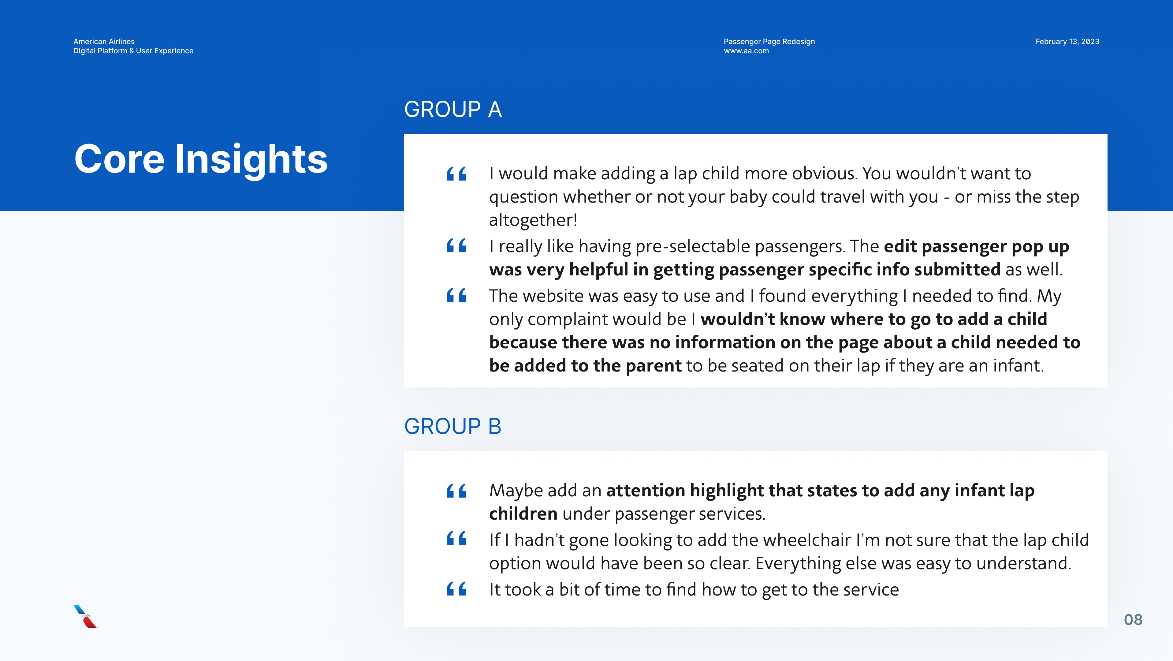
We then take these designs into UserZoom and begin testing out the different layouts. Tests are showing the card layout is working. The business decides to move forward and development work begins.

Deprioritization and Updated Requirements
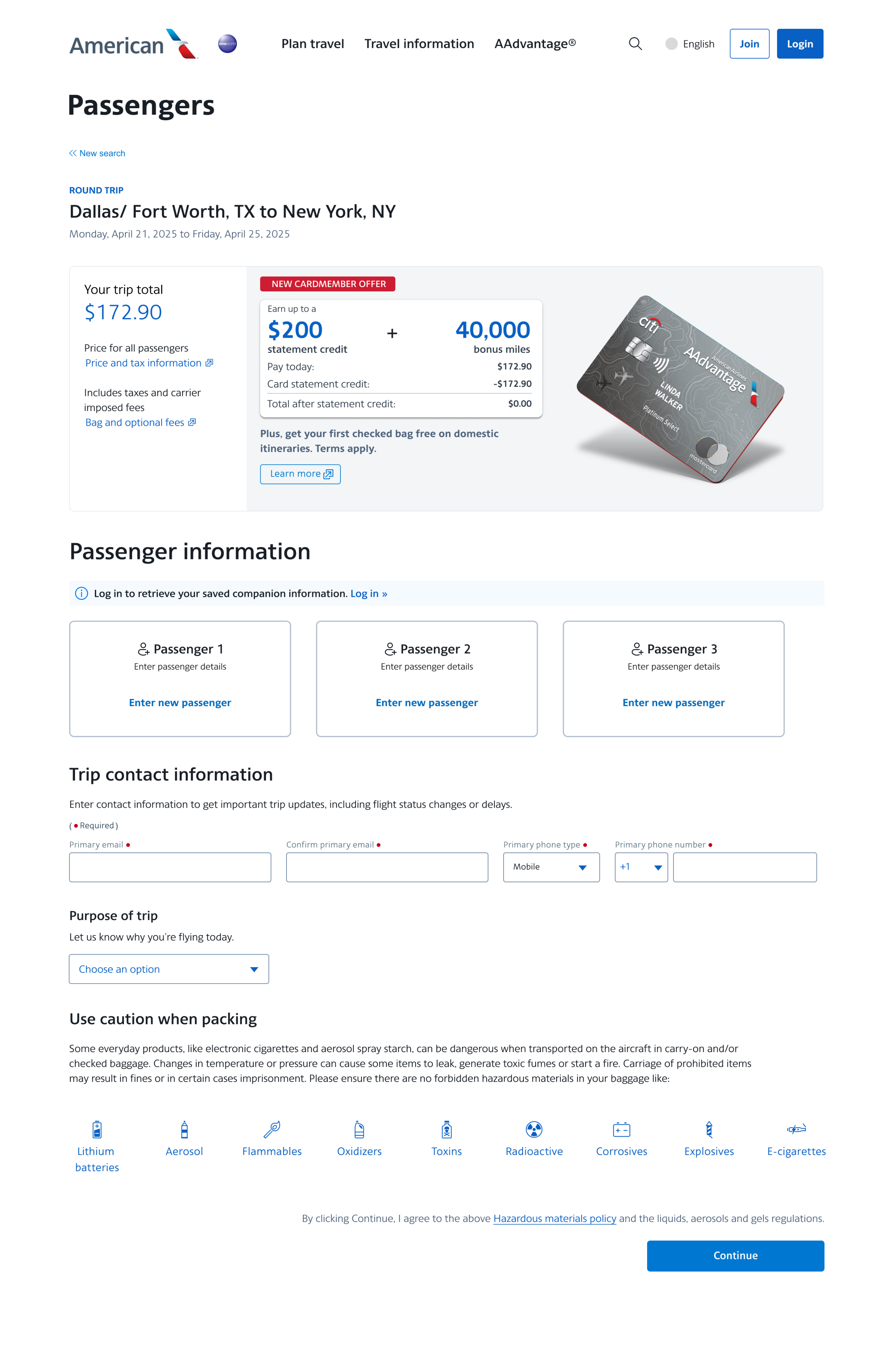
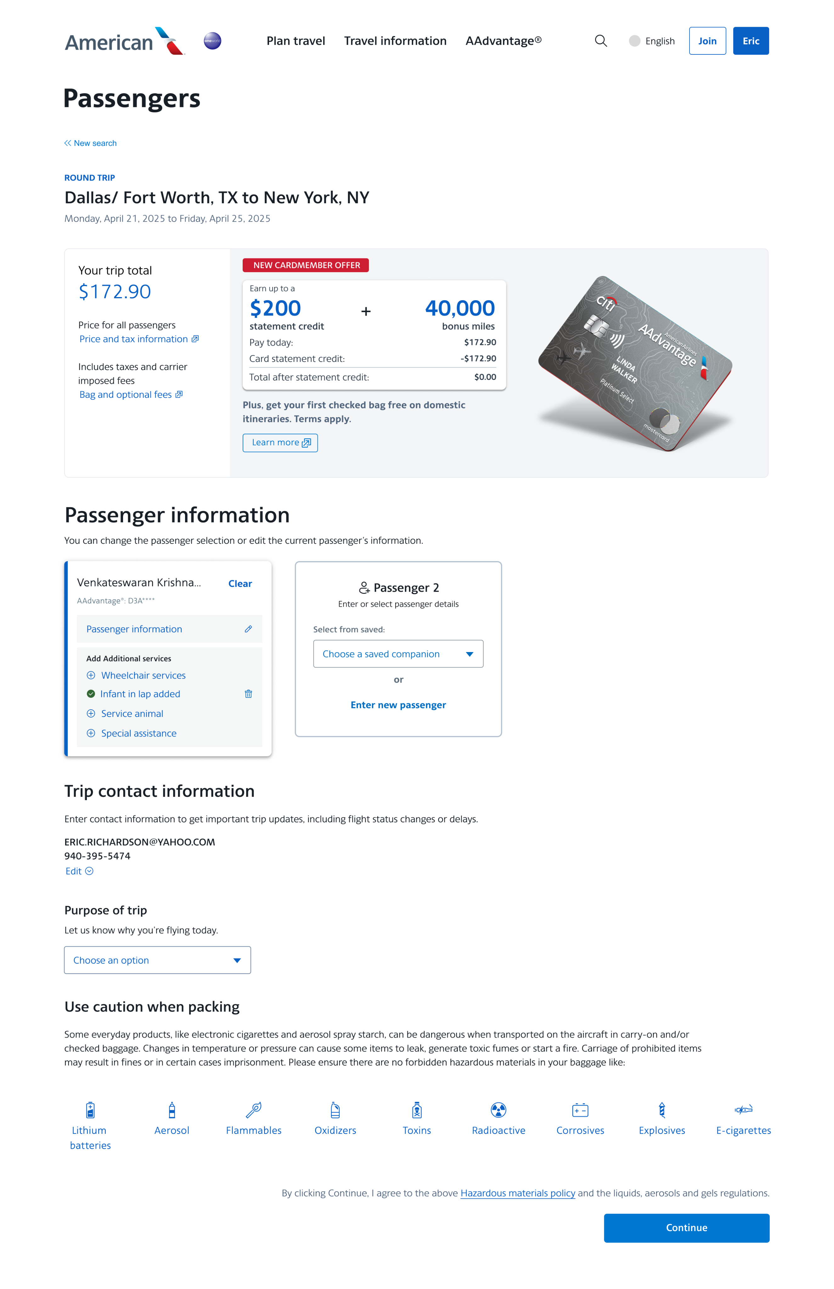
The business over the next couple of years pivots to more critical initiatives and the passenger page redesign is placed lower on the priority list. In 2025 the project is brought back. Though the team wanted to do more testing due to the elapsed time, requirements stated that since the project was already developed few changes could be made. The project owner said the Citi ad placement and size could not be changed and companion selection to be integrated into the modal.
Project Failure
We launch an A/B test over the summer to see how the new page will perform. 10% of our customer base are seeing an uptick in error rates instead of the expected reduction. This is affecting revenue so we need to quickly figure out what’s happening.
Analytics Research
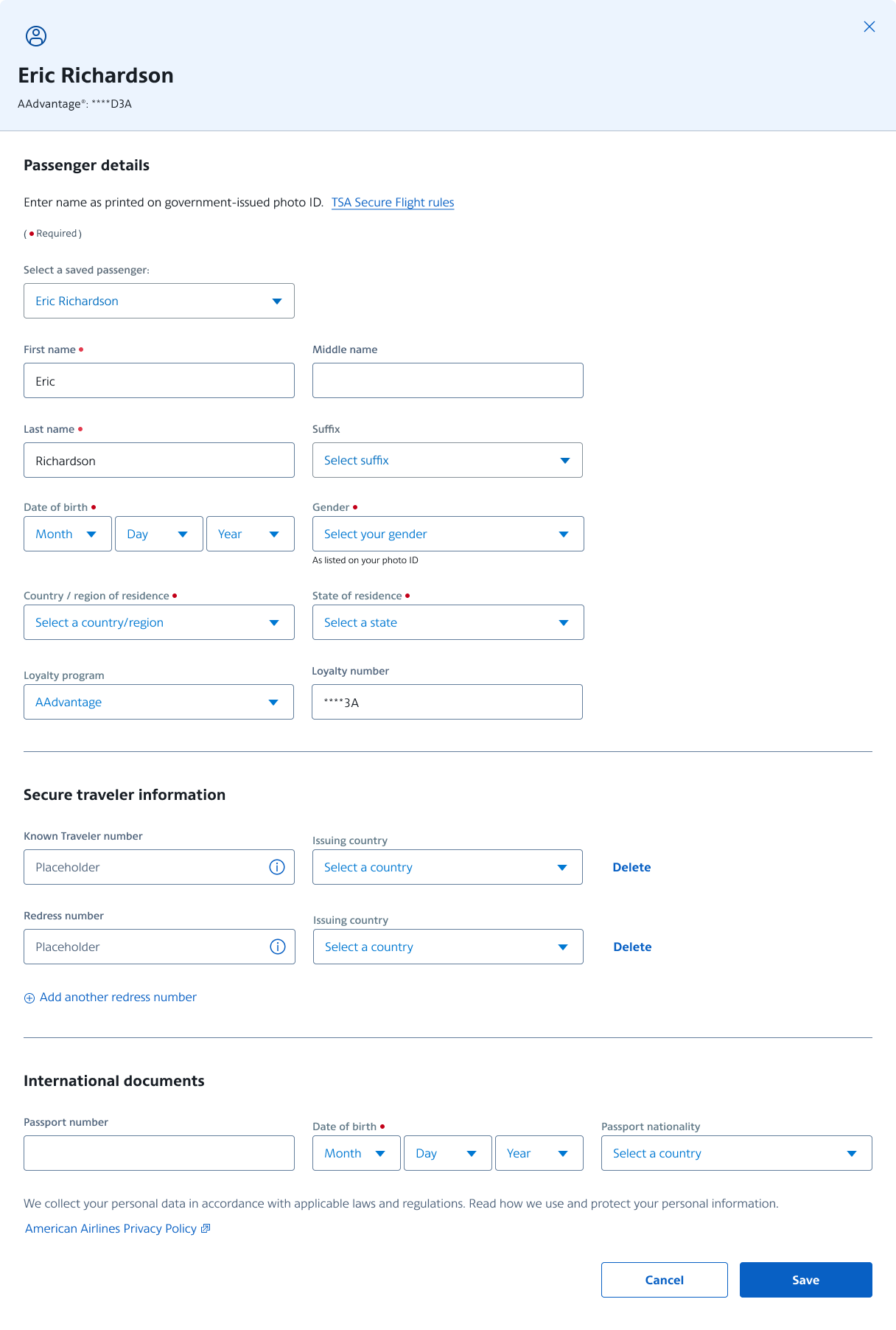
We use our analytics tool, Quantum Metric, to watch replays of the affected customers in action. They are not seeing the cards as key actions on the page so they click Continue and see errors. This is the opposite of our goals....how can we fix this?
Redesign and Success
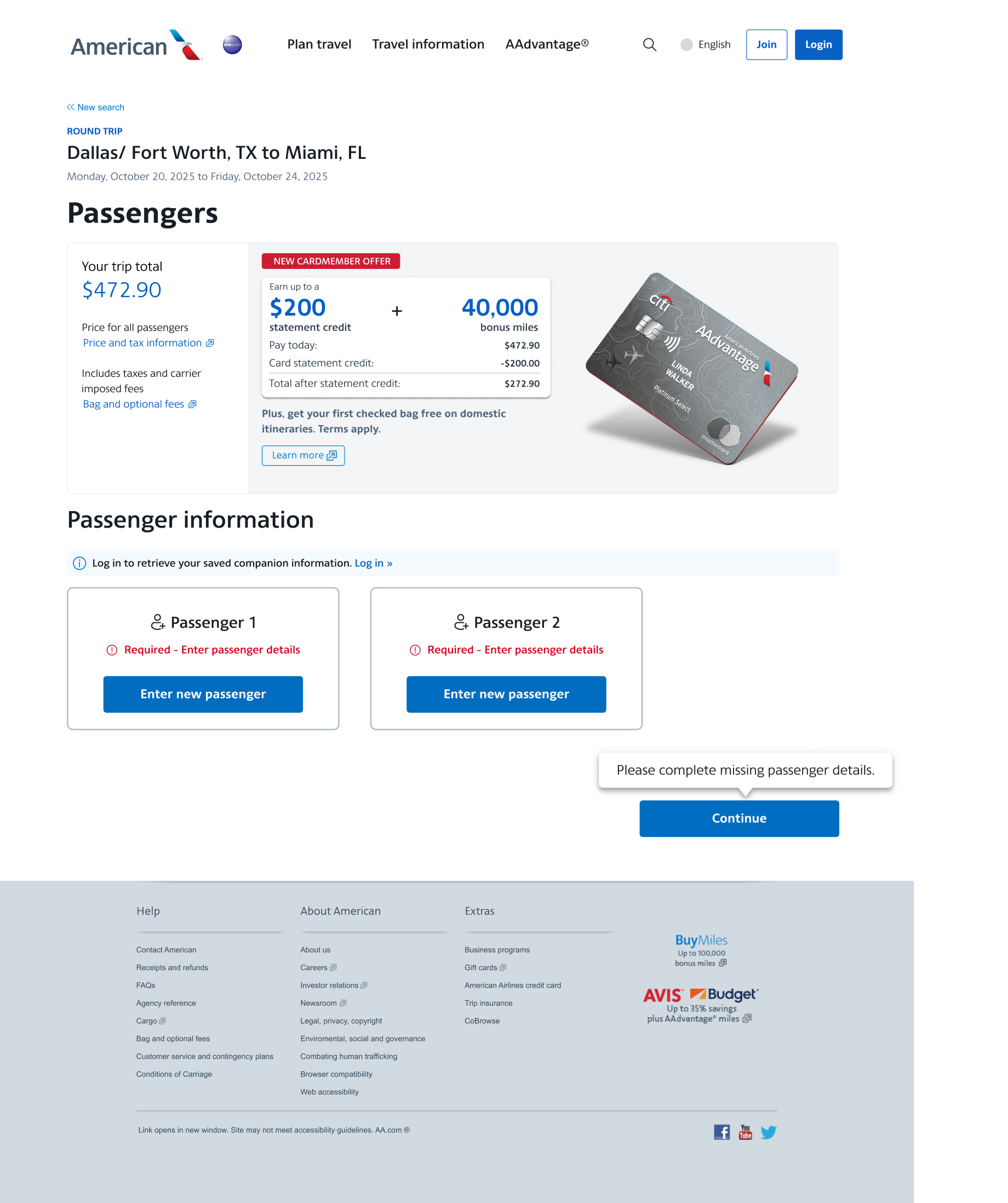
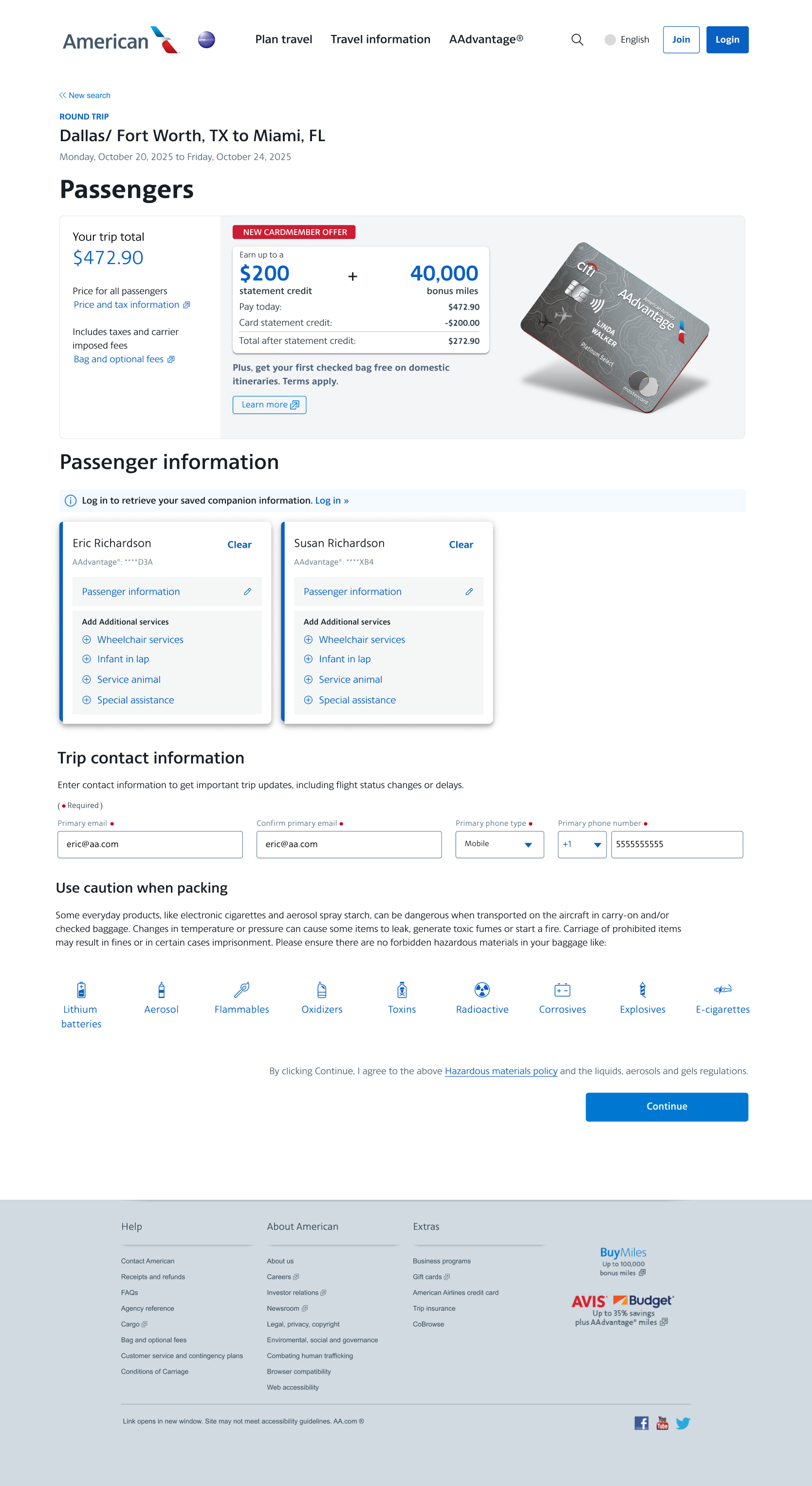
We asked ourselves....how do we prompt the user to fill out their passenger information? The answer was found with a competitor. Let’s hint to the user when they have something to complete still on the page and highlight those areas. Once they have completed their cards successfully, we then show the rest of the page for them to complete and continue.
Goals achieved
After the redesign, error rates decreased significantly...from 12% down to less than 0.1%! This was better than our initial goal for the redesign. This change not only helped customers understand what to do on the page but also improved revenue for the business.

Passenger page: Easing the pain of data entry

Challenge: Customer error rates on the passenger details page consistently between 4-5%
Solution: Redesign the page to reduce noise and keep only the information necessary for the booking
Outcome: Error rates reduced significantly - less than >.1%!
Background
The passenger details page is essential for processing their needed travel information, but users consistently encounter errors that slow down data entry. Confusing labels and complex layouts lead to mistakes in entering names, contact details, and travel documents. These errors cause delays and lower customer satisfaction. They also create extra work for AA staff to go in and fix these mistakes. To address this, we needed a redesign of the page to improve the user experience with a cleaner interface and clearer instructions.
Goals:
- reduce errors by 2% or greater
- increase efficiency by reducing time on task
- enhance the experience for both passengers and staff
Discovery
Using design thinking, the business and UX came together to determine what was most important to live on the passenger page and what could go away. Pictured below was our LUMA recipe where we used:
- Rose, Thorn, Bud to find the positive, negative and potential improvements on the page
- Affinity Clustering to take all those ideas and cluster them into themes
- Visualize the vote to determine key needs of the new design
- Importance/Difficulty Matrix to plot the top votes into a grid of highest ROI, quick wins, lowest ROI and strategic.

The key takeaways from design thinking were:
- remove unnecessary fields from the page (Promo codes and accounts),
- reduce the ad size and place lower on the page, and
- chunk the passenger data entry into smaller bites.


In conjunction with this project, the Manage Reservations team was also updating their landing page. They were also needing to find a way for passengers to view/edit their personal data without taking up too much space on the page. Our two teams decided to use a card component to be consistent across Shop/Buy and Manage Res.
Design and Research
Iterations on how the cards could be displayed were started asking ourselves “how do they select who will be flying?”, “how will the customer edit passenger details?”, “how can account holders select saved companions?”, “how can they assign special services?”, etc.


We then take these designs into UserZoom and begin testing out the different layouts. Tests are showing the card layout is working. The business decides to move forward and development work begins.


Deprioritization and Updated Requirements
The business over the next couple of years pivots to more critical initiatives and the passenger page redesign is placed lower on the priority list. In 2025 the project is brought back. Though the team wanted to do more testing due to the elapsed time, requirements stated that since the project was already developed few changes could be made. The project owner said the Citi ad placement and size could not be changed and companion selection to be integrated into the modal.
Project Failure
We launch an A/B test over the summer to see how the new page will perform. 10% of our customer base are seeing an uptick in error rates instead of the expected reduction. This is affecting revenue so we need to quickly figure out what’s happening.


Analytics Research
We use our analytics tool, Quantum Metric, to watch replays of the affected customers in action. They are not seeing the cards as key actions on the page so they click Continue and see errors. This is the opposite of our goals....how can we fix this?
Redesign and Success
We asked ourselves....how do we prompt the user to fill out their passenger information? The answer was found with a competitor. Let’s hint to the user when they have something to complete still on the page and highlight those areas. Once they have completed their cards successfully, we then show the rest of the page for them to complete and continue.


Goals achieved
After the redesign, error rates decreased significantly...from 12% down to less than 0.1%! This change not only helped customers understand what to do on the page but also improved revenue for the business.

Passenger page: Easing the pain of data entry

Challenge: Customer error rates on the passenger details page consistently between 4-5%
Solution: Redesign the page to reduce noise and keep only the information necessary for the booking
Outcome: Error rates reduced significantly - less than >.1%!
Background
The passenger details page is essential for processing their needed travel information, but users consistently encounter errors that slow down data entry. Confusing labels and complex layouts lead to mistakes in entering names, contact details, and travel documents. These errors cause delays and lower customer satisfaction. They also create extra work for AA staff to go in and fix these mistakes. To address this, we needed a redesign of the page to improve the user experience with a cleaner interface and clearer instructions.
Goals:
- reduce errors by 2% or greater
- increase efficiency by reducing time on task
- enhance the experience for both passengers and staff
Discovery
Using design thinking, the business and UX came together to determine what was most important to live on the passenger page and what could go away. Pictured below was our LUMA recipe where we used:
- Rose, Thorn, Bud to find the positive, negative and potential improvements on the page
- Affinity Clustering to take all those ideas and cluster them into themes
- Visualize the vote to determine key needs of the new design
- Importance/Difficulty Matrix to plot the top votes into a grid of highest ROI, quick wins, lowest ROI and strategic.

The key takeaways from design thinking were:
- remove unnecessary fields from the page (Promo codes and accounts),
- reduce the ad size and place lower on the page, and
- chunk the passenger data entry into smaller bites.


In conjunction with this project, the Manage Reservations team was also updating their landing page. They were also needing to find a way for passengers to view/edit their personal data without taking up too much space on the page. Our two teams decided to use a card component to be consistent across Shop/Buy and Manage Res.
Design and Research
Iterations on how the cards could be displayed were started asking ourselves “how do they select who will be flying?”, “how will the customer edit passenger details?”, “how can account holders select saved companions?”, “how can they assign special services?”, etc.


We then take these designs into UserZoom and begin testing out the different layouts. Tests are showing the card layout is working. The business decides to move forward and development work begins.


De-prioritization and Updated Requirements
The business over the next couple of years pivots to more critical initiatives and the passenger page redesign is placed lower on the priority list. In 2025 the project is brought back. Though the team wanted to do more testing due to the elapsed time, requirements stated that since the project was already developed few changes could be made. The project owner said the Citi ad placement and size could not be changed and companion selection to be integrated into the modal.
Project Failure
We launch an A/B test over the summer to see how the new page will perform. 10% of our customer base are seeing an uptick in error rates instead of the expected reduction. This is affecting revenue so we need to quickly figure out what’s happening.


Analytics Research
We use our analytics tool, Quantum Metric, to watch replays of the affected customers in action. They are not seeing the cards as key actions on the page so they click Continue and see errors. This is the opposite of our goals....how can we fix this?
Redesign and Success
We asked ourselves....how do we prompt the user to fill out their passenger information? The answer was found with a competitor. Let’s hint to the user when they have something to complete still on the page and highlight those areas. Once they have completed their cards successfully, we then show the rest of the page for them to complete and continue.


Goals achieved
After the redesign, error rates decreased significantly...from 12% down to less than 0.1%! This was better than our initial goal for the redesign. This change not only helped customers understand what to do on the page but also improved revenue for the business.
