

Upgrades: Giving customers the options they need

Challenge: Increase revenue of the seats ancillary product line
Solution: Design a page that will offer customers the flexibility to choose upgraded seats for each leg of the flight
Outcome: $3-4 million in new revenue generated in the first year; second phase adding in miles redemption generated 6 billion in miles used
Background
Post-booking seat upgrades represent a significant opportunity to drive ancillary revenue and strengthen customer engagement. However, American Airline’s existing process offered limited flexibility for customers to modify or enhance their seating after purchase, resulting in missed upsell potential. To address this, AA started an initiative to design and implement a more flexible post-purchase seat upsell experience. The goal was to increase revenue per passenger by offering targeted upgrade options based on fare class and route.
Discovery
What are the opportunities?
1
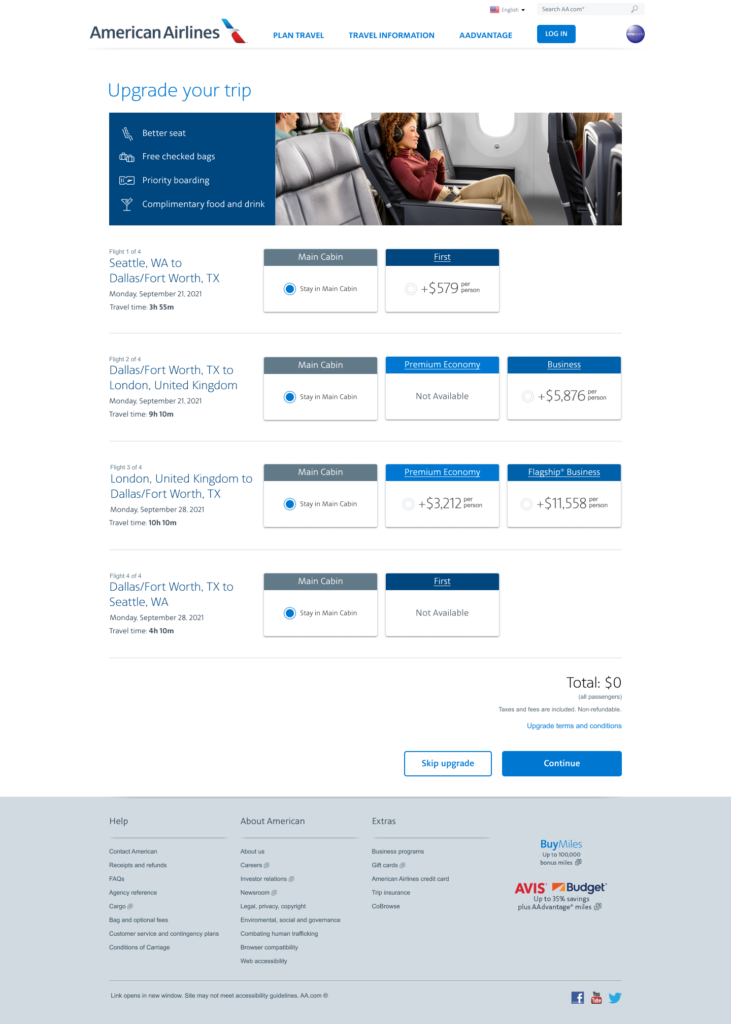
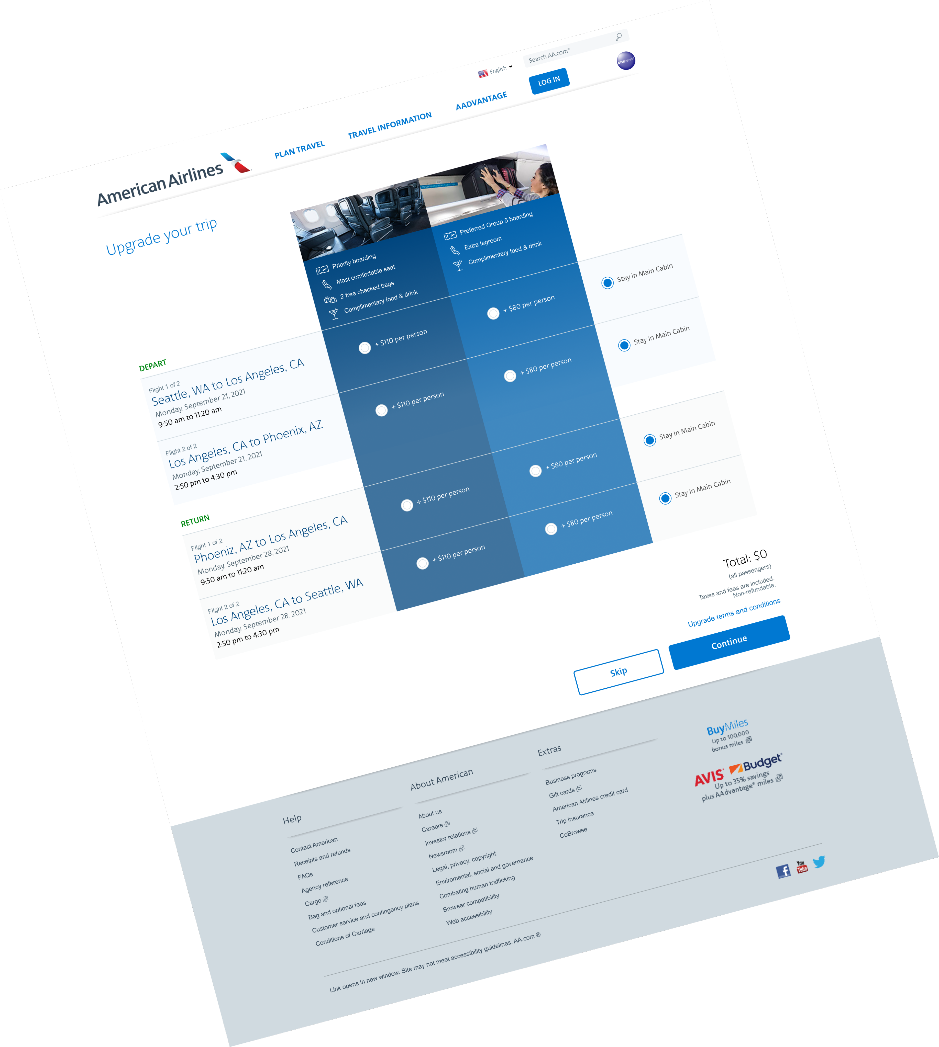
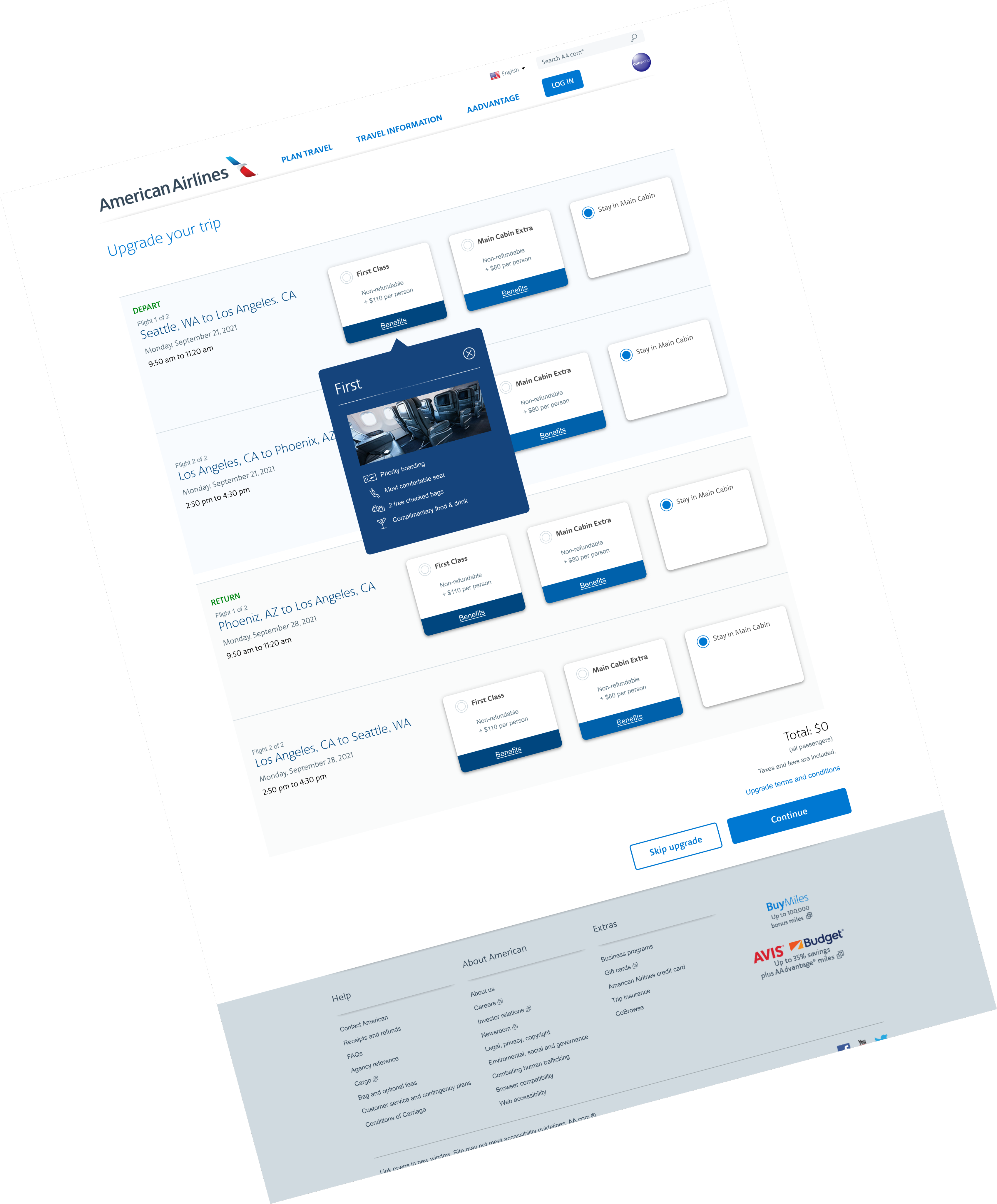
Provide two upgrade offers to the customer (simple and focused)
2
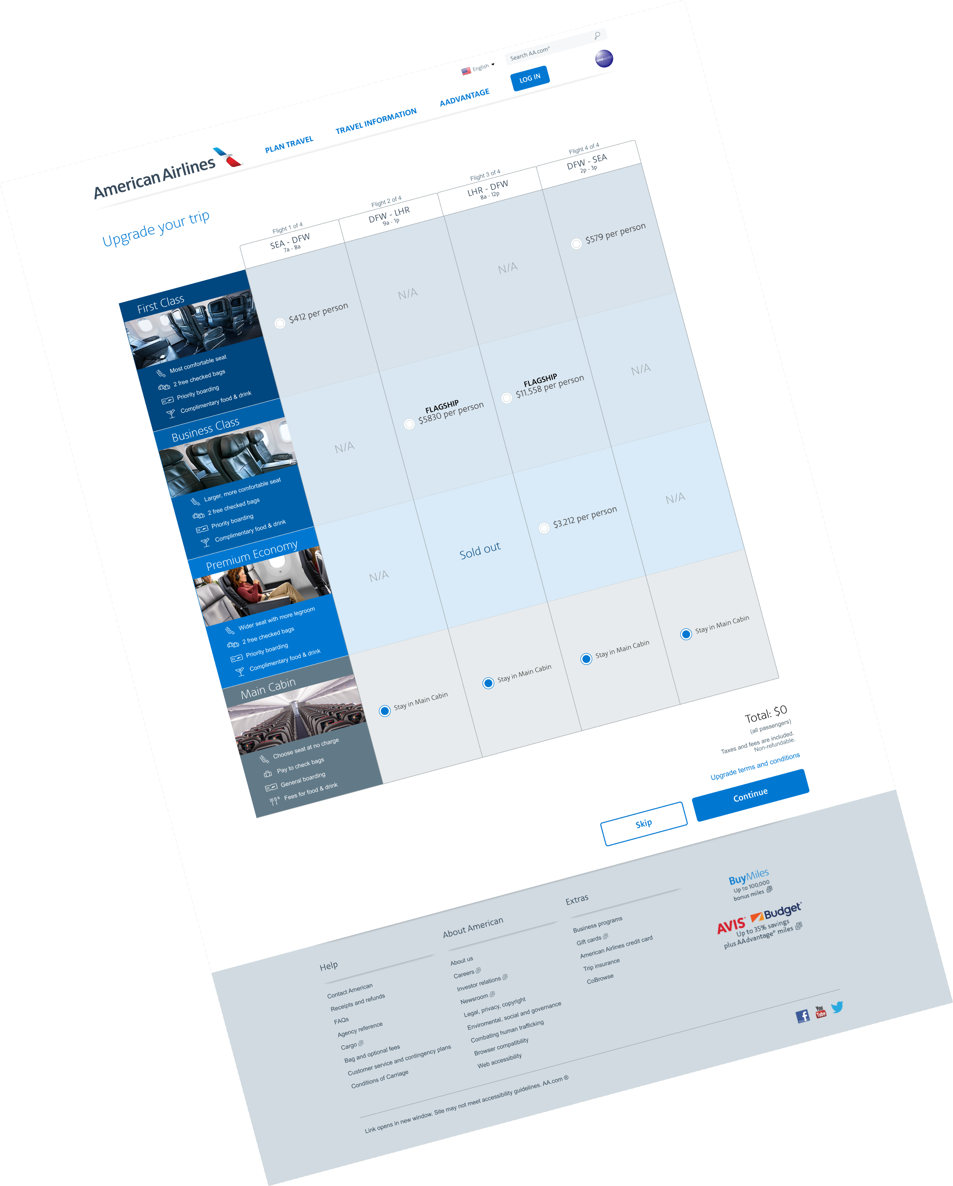
Present offers by segment (single leg) to give the user flexible options
3
Display flight duration to help customers decide which flight to upgrade.
How do we present this offer?
- Discovery research: we studied our competitors and how they presented their upgrade offers and other commerce sites and how offers were presented to their customers
- Wireframes: I started creating a variety of layouts based on the outlined requirements


Where do we present this offer?
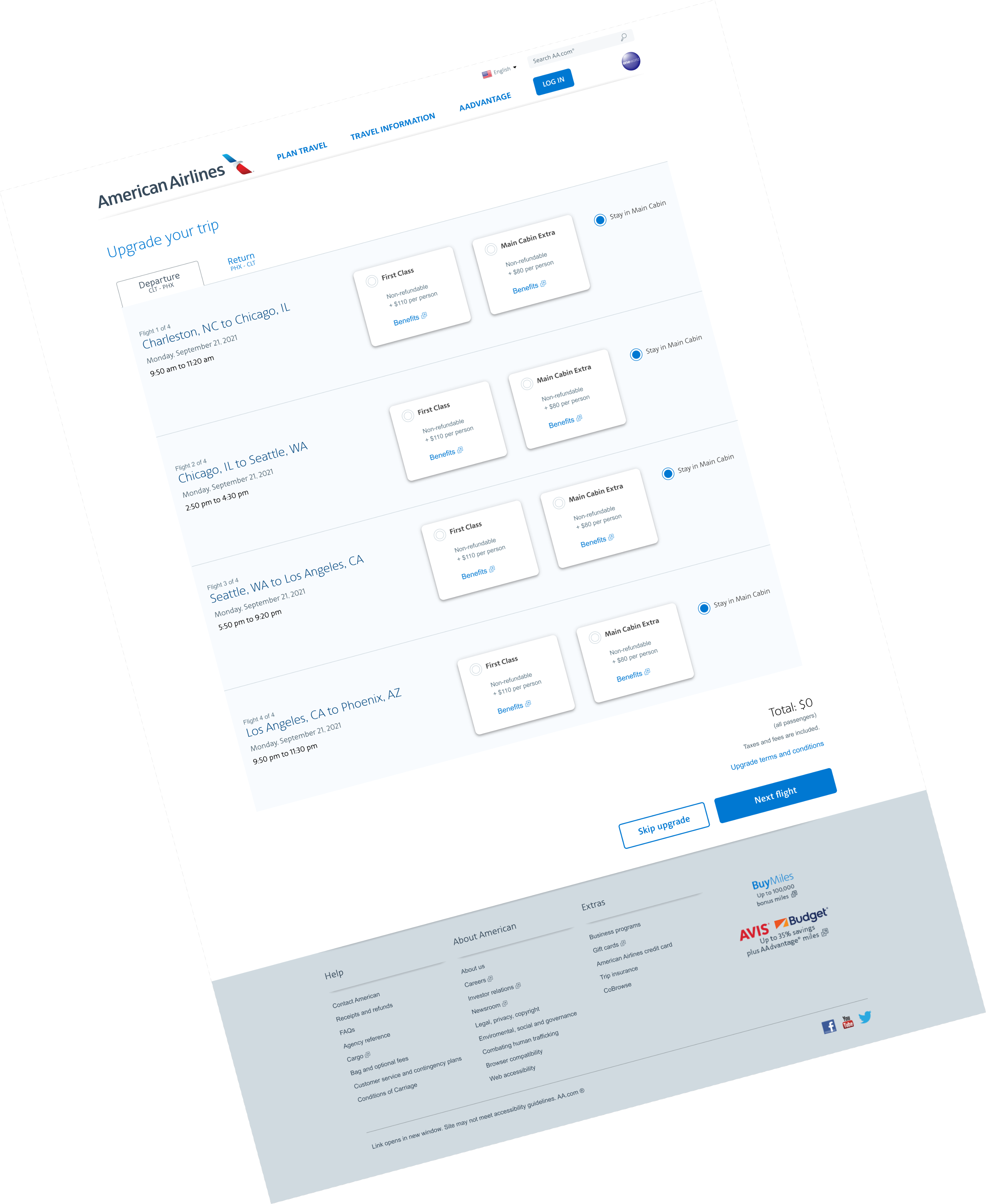
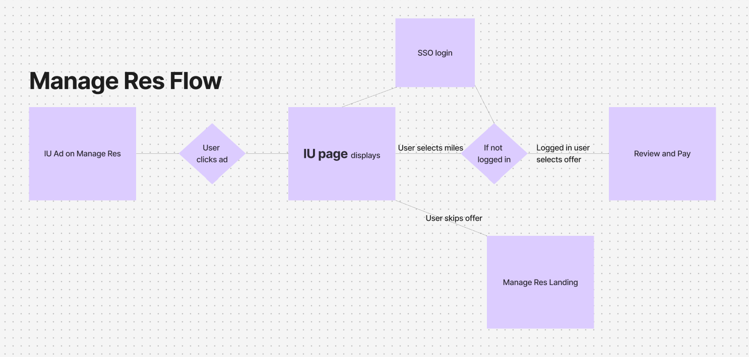
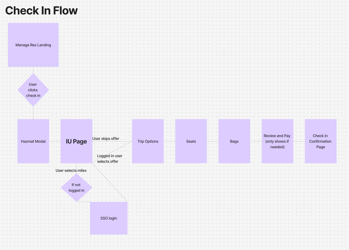
The first challenge was how best to position the teaser and the full page in order to get optimized click-through rates. The landing page of Manage your Reservation made the most sense for the teaser and displaying the full page during the Check-in flow would catch customers’ attention.
Final design
The card layout was chosen for it’s scannability, ease of use and ability to present multiple offers without overwhelming the page.


In the first year, Instant Upgrades produced between $3-4 million in profit for American Airlines.

The Story Continues...

After record-breaking profits, business and UX came together to ask “How can we improve this experience further?”
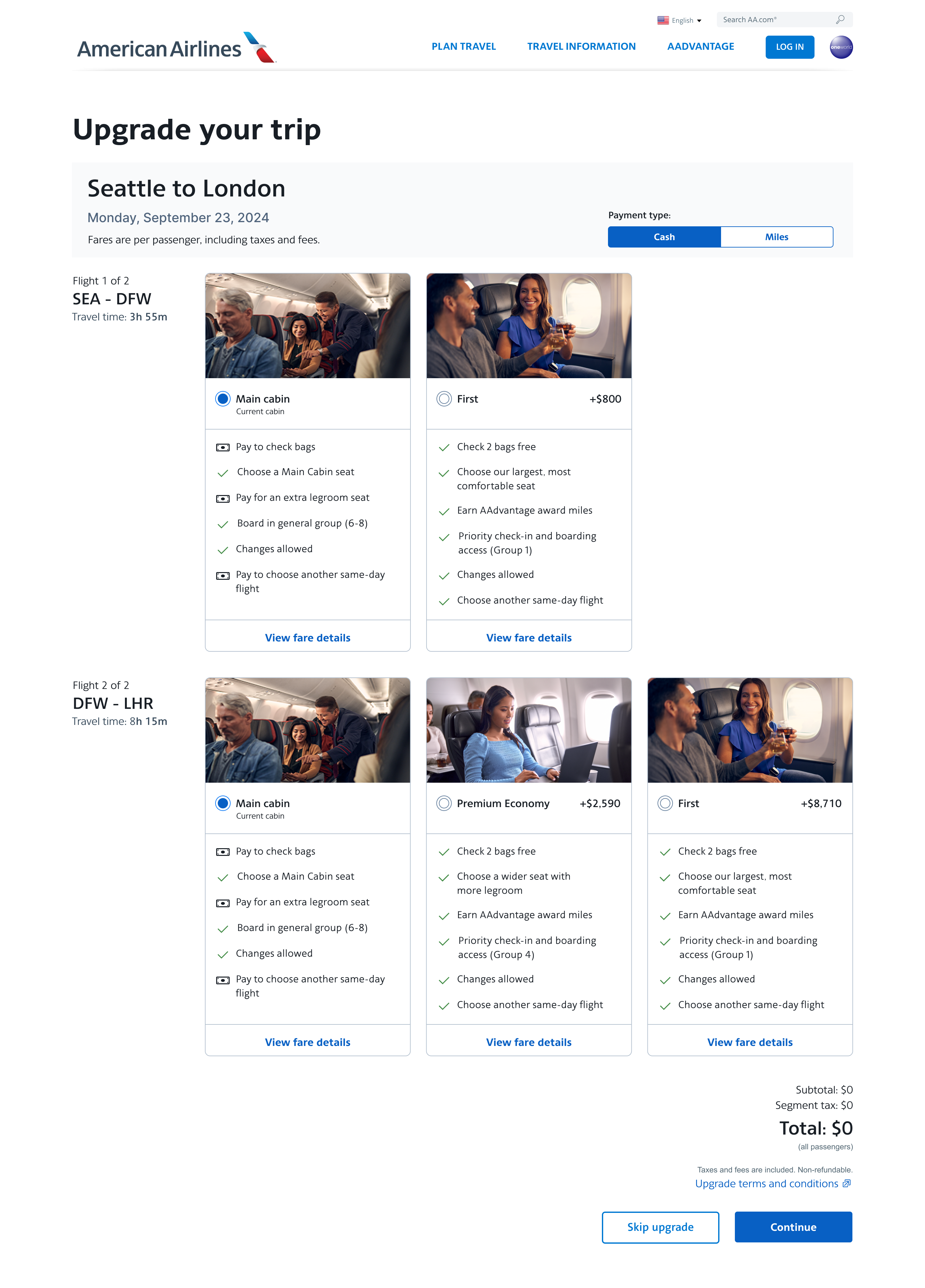
- Let’s reflect the new design of the Choose Flights page and display the benefits of each upgrade so the user can compare them
- For our loyal customers let’s offer them the choice between paying in cash or paying in miles they have earned
Discovery
Design Thinking
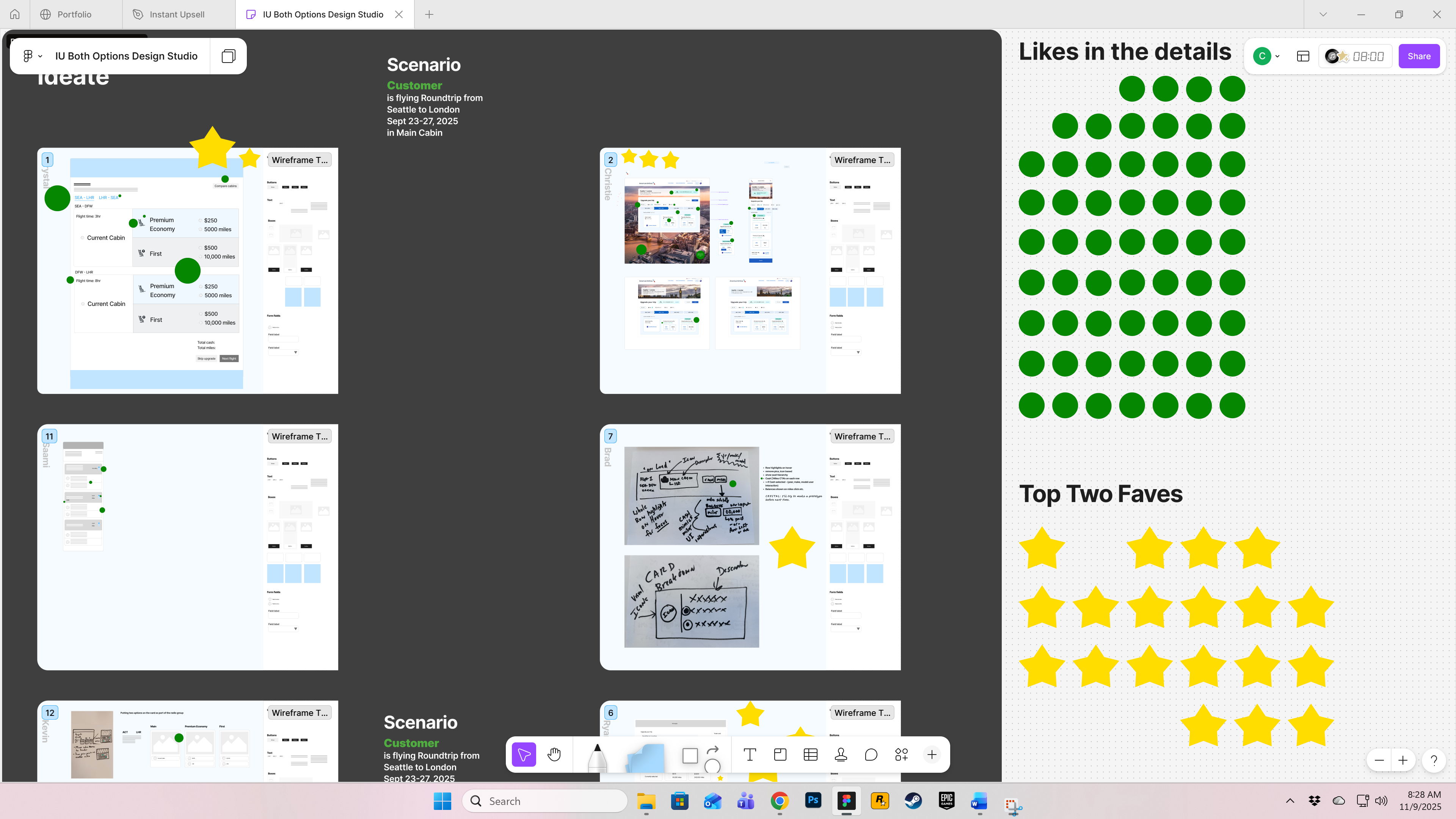
I started my redesign process by using a design thinking recipe of storyboarding and dot voting. During the meeting, each designer was given a specific amount of time to complete a design idea and then present it to the group. The group is then given voting stickers to determine likes and dislikes.
How might we show both options concurrently on the IU page?
Design
Technical Requirements Change
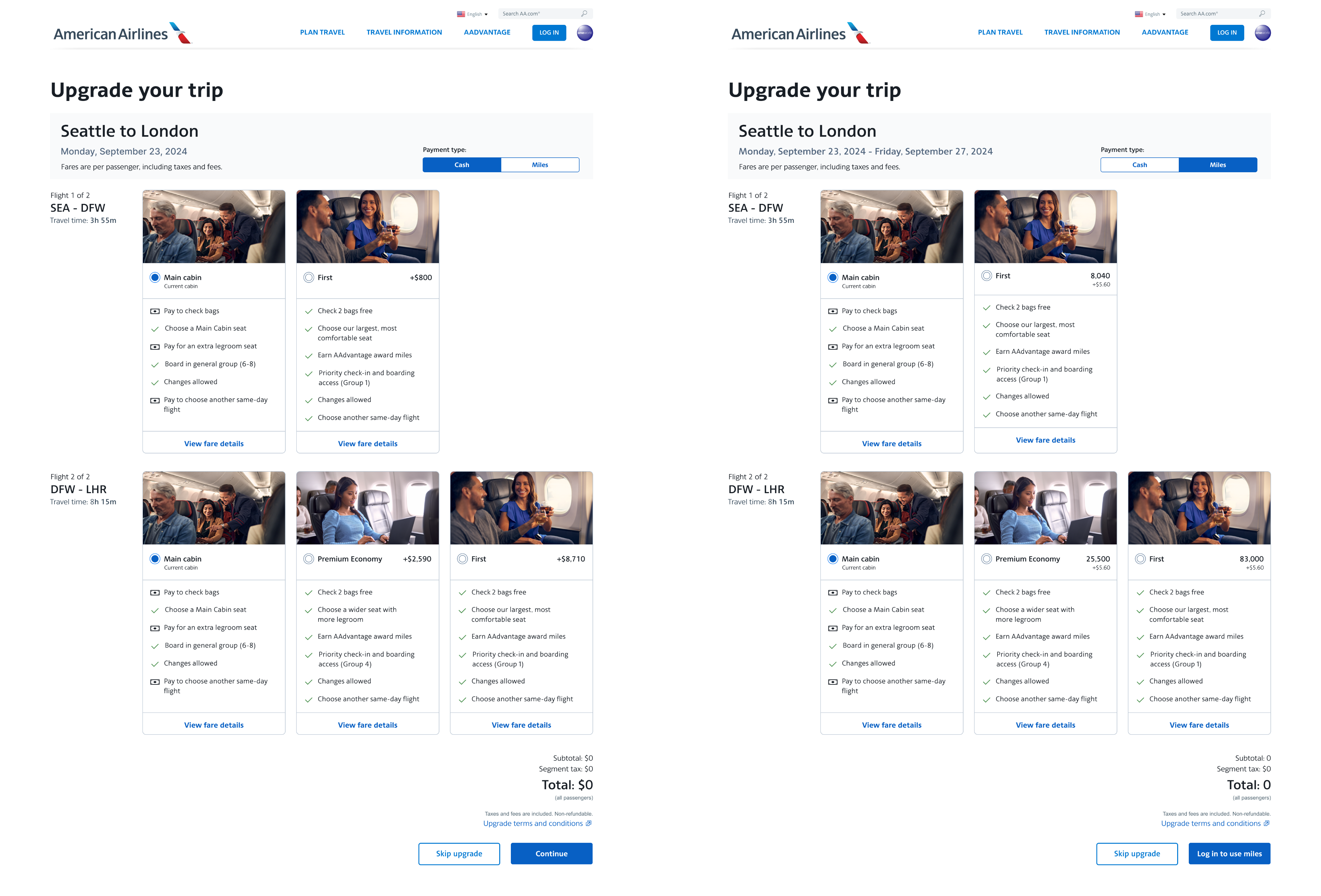
Due to systems restraints, we could no longer iterate on a combo of cash plus miles but instead letting the user choose one or the other. This led to a toggle placed above the offers. We tested the design in UserZoom and it successfully passed the comprehension questions around changing currencies.
Research
Usability Testing
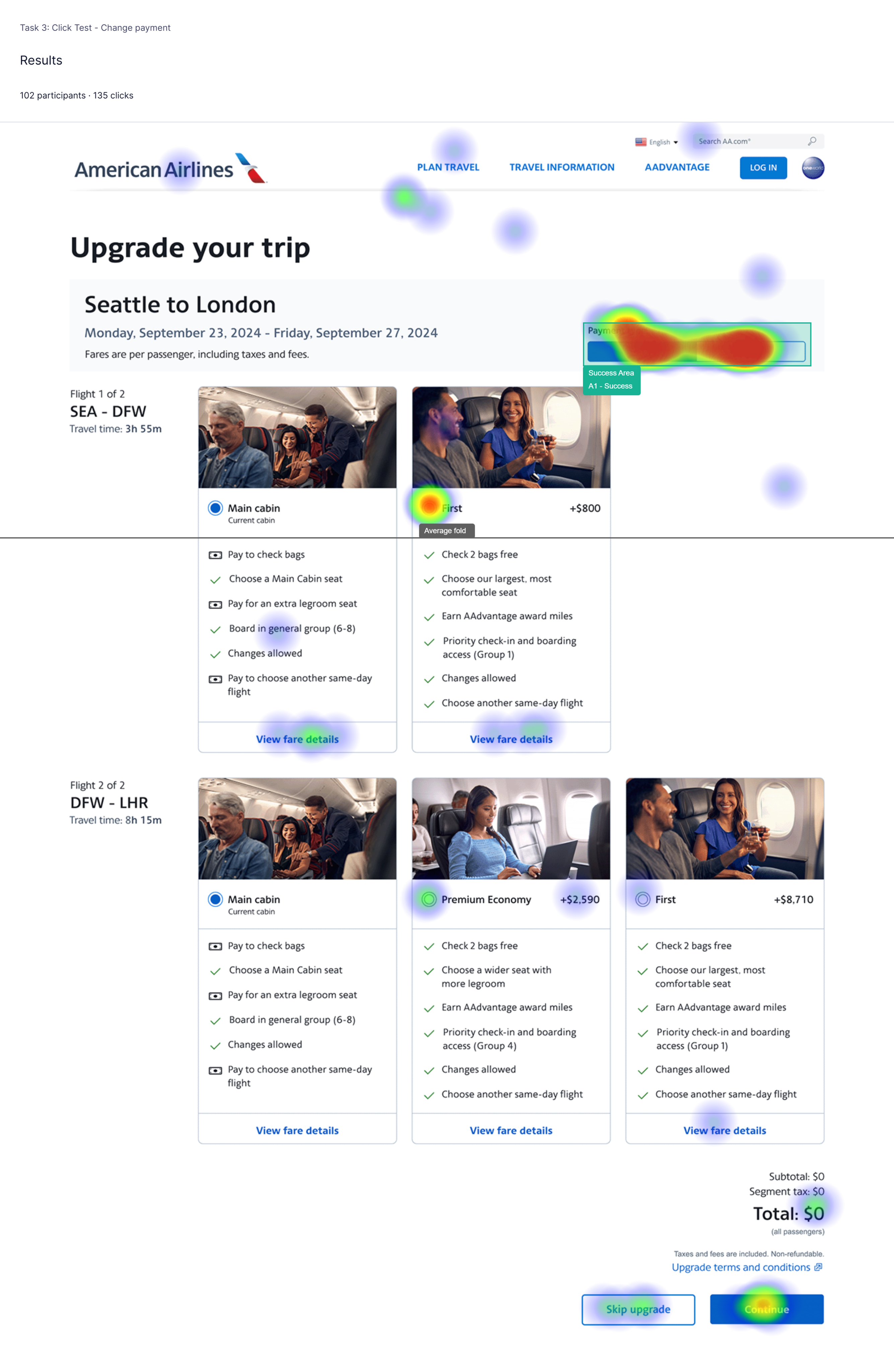
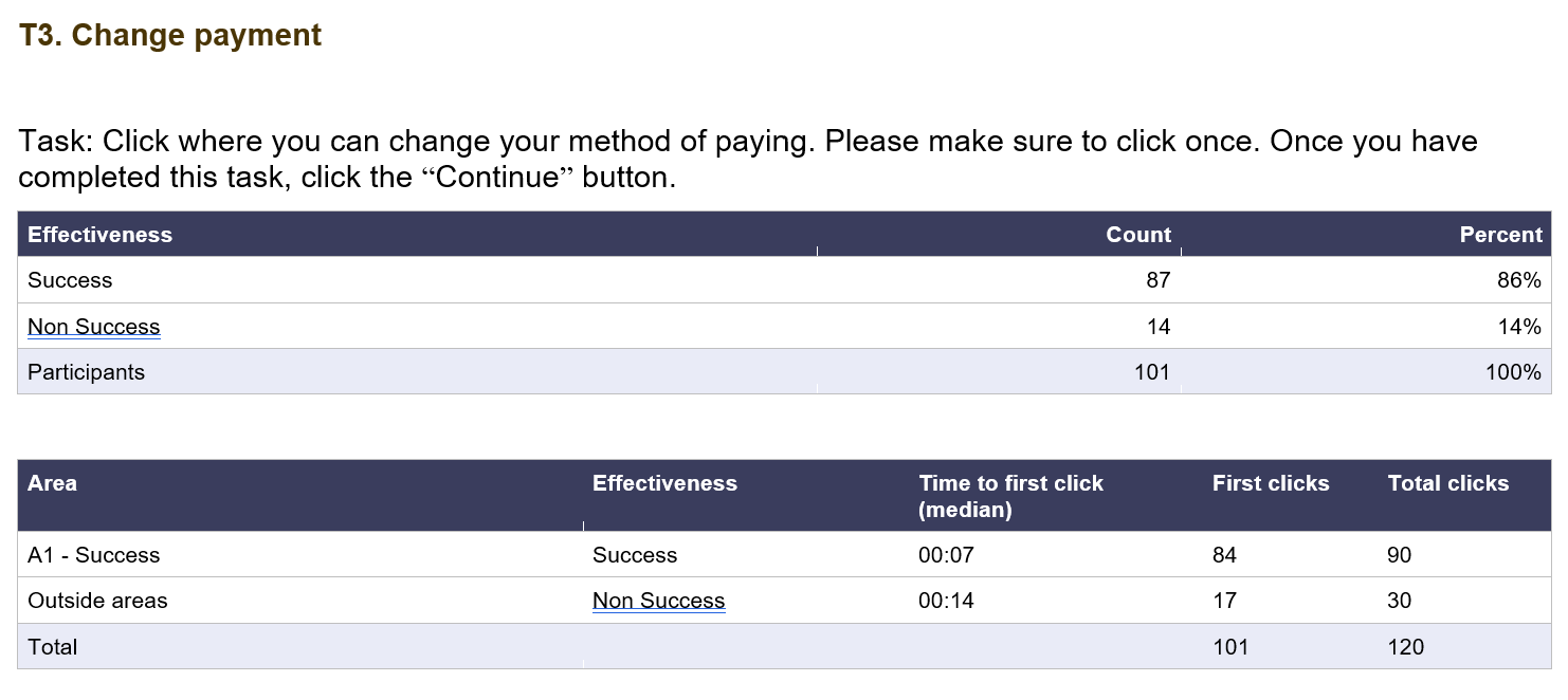
We tested the design in UserZoom with both guest users and loyalty members. Several rounds of testing were done and each successfully passed the comprehension questions around changing currencies, how to view their current miles balance, and the price they would pay per upgrade.
Final Design
Requirements Change (Again)
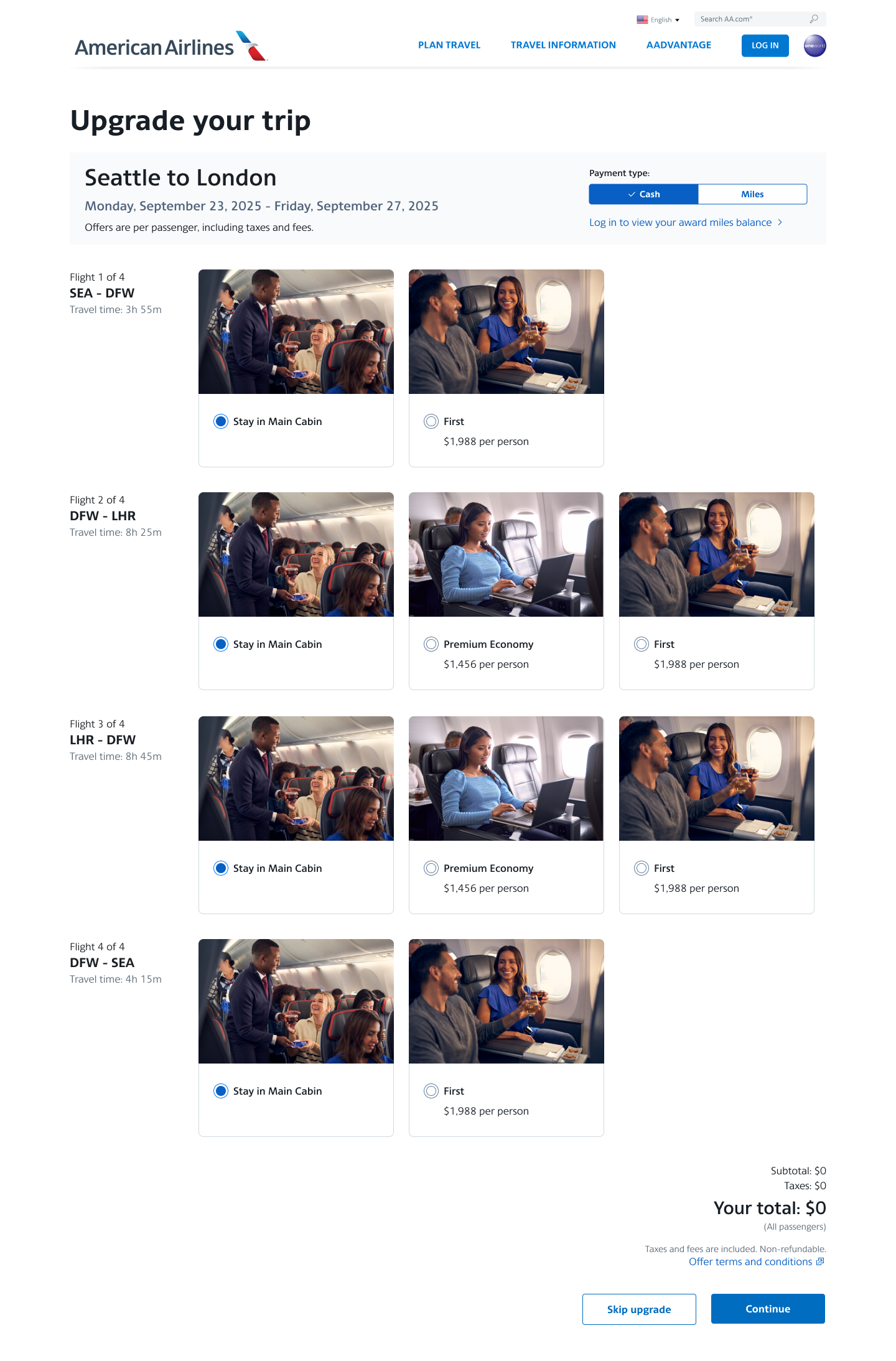
Technical limitations changed the design requirements yet again. We could no longer display the benefits of a cabin upgrade so we simplified the cards even further.


After launch, over 6 billion loyalty miles are redeemed by AAdvantage status members.
Continued Success
Revenue and Miles Redemption Increase
Today, American Airlines continues to see record profits from the Upgrade page, while giving customers the options and flexibility they need.


Upgrades: Giving customers the options they need

Challenge: Increase revenue of the seats ancillary product line
Solution: Design a page that will offer customers the flexibility to choose upgraded seats for each leg of the flight
Outcome: $3-4 million in new revenue generated in the first year; second phase adding in miles redemption generated 6 billion in miles used
Background
Post-booking seat upgrades represent a significant opportunity to drive ancillary revenue and strengthen customer engagement. However, American Airline’s existing process offered limited flexibility for customers to modify or enhance their seating after purchase, resulting in missed upsell potential. To address this, AA started an initiative to design and implement a more flexible post-purchase seat upsell experience. The goal was to increase revenue per passenger by offering targeted upgrade options based on fare class and route.
Discovery
What are the opportunities?
1
Provide two upgrade offers to the customer (simple and focused)
2
Present offers by segment (single leg) to give the user flexible options
3
Display flight duration to help customers decide which flight to upgrade.
How do we present this offer?
- Discovery research: we studied our competitors and how they presented their upgrade offers and other commerce sites and how offers were presented to their customers
- Wireframes: I started creating a variety of layouts based on the outlined requirements


Where do we present this offer?
The first challenge was how best to position the teaser and the full page in order to get optimized click-through rates. The landing page of Manage your Reservation made the most sense for the teaser and displaying the full page during the Check-in flow would catch customers’ attention.


Final design
The card layout was chosen for it’s scannability, ease of use and ability to present multiple offers without overwhelming the page.


In the first year, Instant Upgrades produced between $3-4 million in profit for American Airlines.

The Story Continues...

After record-breaking profits, business and UX came together to ask “How can we improve this experience further?”
- Let’s reflect the new design of the Choose Flights page and display the benefits of each upgrade so the customer can compare them
- For our loyal customers, let’s offer them the option of using both cash and miles to pay for an upgrade
- Lastly, let’s put images of the seat with each offer so the customer knows what they are paying for
Discovery
Design Thinking
I started my redesign process by using a design thinking recipe of storyboarding and dot voting. During the meeting, each designer was given a specific amount of time to complete a design idea and then present it to the group. The group is then given voting stickers to determine likes and dislikes.
How might we show both options concurrently on the IU page?

Design
Technical Requirements Change
Due to systems restraints, we could no longer iterate on a combo of cash plus miles but instead letting the user choose one or the other. This led to a toggle placed above the offers. We tested the design in UserZoom and it successfully passed the comprehension questions around changing currencies.

Research
Usability Testing
We tested the design in UserZoom with both guest users and loyalty members. Several rounds of testing were done and each successfully passed the comprehension questions around changing currencies, how to view their current miles balance, and the price they would pay per upgrade.


Final Design
Requirements Change (Again)
Technical limitations changed the design requirements yet again. We could no longer display the benefits of a cabin upgrade so we simplified the cards even further.


After launch, over 6 billion loyalty miles are redeemed by AAdvantage status members.
Continued Success
Revenue and Miles Redemption Increase
Today, American Airlines continues to see record profits from the Upgrade page, while giving customers the options and flexibility they need.


Upgrades: Giving customers the options they need

Challenge: Increase revenue of the seats ancillary product line
Solution: Design a page that will offer customers the flexibility to choose upgraded seats for each leg of the flight
Outcome: $3-4 million in new revenue generated in the first year; second phase adding in miles redemption generated 6 billion in miles used
Background
Post-booking seat upgrades represent a significant opportunity to drive ancillary revenue and strengthen customer engagement. However, American Airline’s existing process offered limited flexibility for customers to modify or enhance their seating after purchase, resulting in missed upsell potential. To address this, AA started an initiative to design and implement a more flexible post-purchase seat upsell experience. The goal was to increase revenue per passenger by offering targeted upgrade options based on fare class and route.
Discovery
What are the opportunities?
1
Provide two upgrade offers to the customer (simple and focused)
2
Present offers by segment (single leg) to give the user flexible options
3
Display flight duration to help customers decide which flight to upgrade.
Where do we present this offer?
The first challenge was how best to position the teaser and the full page in order to get optimized click-through rates. The landing page of Manage your Reservation made the most sense for the teaser and displaying the full page during the Check-in flow would catch customers’ attention.


How do we present this offer?
- Discovery research: we studied our competitors and how they presented their upgrade offers and other commerce sites and how offers were presented to their customers
- Wireframes: I started creating a variety of layouts based on the outlined requirements


Final design
The card layout was chosen for it’s scannability, ease of use and ability to present multiple offers without overwhelming the page.


In the first year, Instant Upgrades produced between $3-4 million in profit for American Airlines.

The Story Continues...

After record-breaking profits, business and UX came together to ask “How can we improve this experience further?”
- Let’s reflect the new design of the Choose Flights page and display the benefits of each upgrade so the customer can compare them
- For our loyal customers, let’s offer them the option of using both cash and miles to pay for an upgrade
- Lastly, let’s put images of the seat with each offer so the customer knows what they are paying for
Discovery
Design Thinking
I started my redesign process by using a design thinking recipe of storyboarding and dot voting. During the meeting, each designer was given a specific amount of time to complete a design idea and then present it to the group. The group is then given voting stickers to determine likes and dislikes.
How might we show both options concurrently on the IU page?

Design
Technical Requirements Change
During our ideation phase, systems restraints changed our design requirements. We could no longer show a combo of cash plus miles but instead have the user choose one or the other. This led to a toggle placed above the offers.

Research
Usability Testing
We tested the design in UserZoom with both guest users and loyalty members. Several rounds of testing were done and each successfully passed the comprehension questions around changing currencies, how to view their current miles balance, and the price they would pay per upgrade.


Final Design
Requirements Change (Again)
Technical limitations changed the design requirements yet again. We could no longer display the benefits of a cabin upgrade so we simplified the cards even further.


After launch, over 6 billion loyalty miles are redeemed by AAdvantage status members.
Continued Success
Revenue and Miles Redemption Increase
Today, American Airlines continues to see record profits from the Upgrade page, while giving customers the options and flexibility they need.
